web accessibility is not accessible.
PROBLEM
The official Web Accessibility Guidelines (WCAG 2.1) are complicated and difficult to understand how to actually implement.
Designing the web for people with physical impairments and disabilities has been overlooked for a long time. With the rise of the WCAG Guidelines and lawyers cracking down on inaccessible websites, more and more of an effort is being made to ensure sites are designed to be accessible to everyone, as they should. However, the WCAG Guidelines are hard to understand, with duplicate content across multiple areas and an unclear path to accessibility.
Many people in the industry feel the web accessibility requires hiring a professional or purchasing an expensive plugin and end up putting it off indefinitely. So I thought to myself…
“How might we pave a clear path to help users start making their website accessible that is easy to understand and actionable?”
BACKGROUND
Attention span is constantly decreasing and textbook heavy layout of information doesn’t retain user engagement nor does it work as an useful reference.
If we can create a way to reorganize and re-display the information in a way that is easy to read and reference, users will be engaged in the content and feel confident in their abilities to implement it, as they can easily refer back to the site whenever necessary.
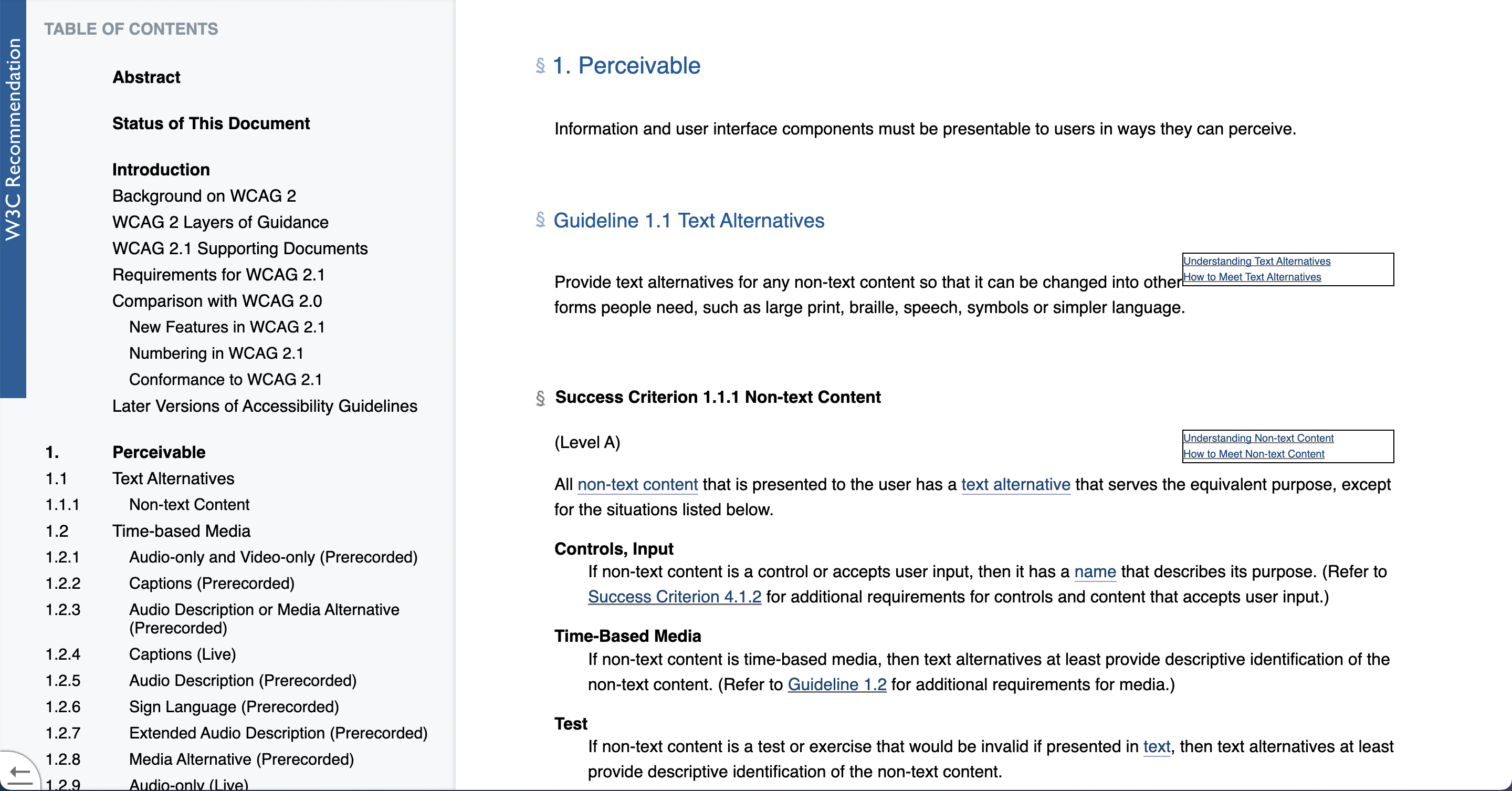
THE CURRENT STATE OF THE WCAG GUIDELINES
SUMMARY OF KEY USER PAINPOINTS:
i) Navigation + Learnability: The content is structured in the form of a documentation report, which lacks clarity as it is text heavy and relies on hyperlinks to navigate between sections of this long scrolling page. It is easy to get lost jumping between sections.
ii) Repetition: The content is explained through their POUR Principles (Perceivable, Operable, Understandable, Robust) as a way to explain the need for accessibility in web. However, upon information architecture analysis of the guidelines, there is a lot of content overlap that could be better understood by grouping by necessary implementation instead.
iii) Effectivity: Effectivity is about making sure users can complete their desired tasks quickly and easily. This website cannot be easily referenced when trying to implement each step, making it an extremely arduous process to actually make their site accessible.
INFORMATION ARCHITECTURE
“How might we create new groupings that allow the user to implement these rules instead of just read them?”
Knowing how websites are designed from start to end and the basics of web development, I was able to take a deep dive into the information and start reconfiguring it in a way that serves the user. By writing out all the rules, the steps to needed to implement and the areas of a website it impacts (content, development, design, SEO, etc.) I was able to sort the information into new groupings that, although they do not follow the POUR principles, actually benefit the user.

SOLUTION
“A website that breaks down the key components of the WCAG to make it easily consumable and implementable.”
I designed a resource website, called All For Web For All, and dissected and grouped the key components of the WCAG and wrote them into specific pages with a high level overview, online resource links, and detailed description and implementation.
Click here to view the finished website
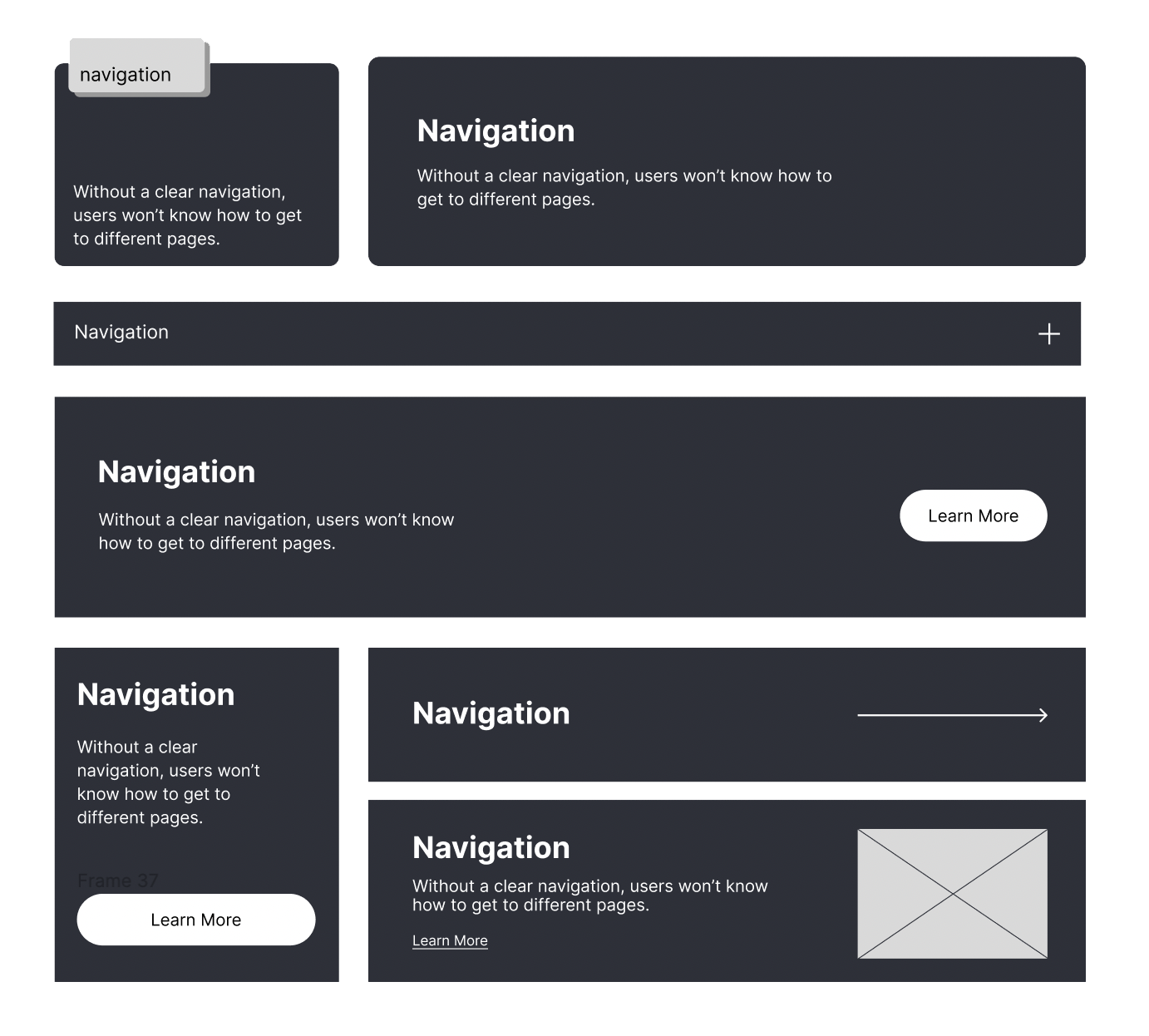
DESIGN EXPLORATION
Having done the groundwork, I moved to a low-fidelity prototype to build out ideas and see how they might fit into the end-to-end experience. I tried various design layouts as a way to display the new groupings of information.
TESTING
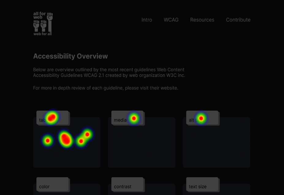
Testing is done throughout the entire iterative process to ensure the designs are understood, and the interface is user-friendly. Through 3 second tests, prototype tests, and heat mapping click tests, we were able to analyze the various user patterns to determine which layout and ux design structure lends itself best to displaying the new information. We tested the various cards with AB preference testing click tests. The final card design was chosen for its clarity, and interactive component, engaging the user to click and learn more.
i) Clarity: The home screen is clear and concise, easy to scan and clutter-free, having the description details displayed on hover. This decreases choice anxiety and overstimulation of information, allowing the user to uncover and learn at their own speed.
ii) Interaction: With the card details displaying on hover, the user gains an interactive component which engages them to want to learn more and discover more. Each card has a different underlying colour which teaches the user they all have different information within. The colour reinforces content grouping as the page for each respective card matches the card’s colour, as well as the colour serving as a fun discovery to keep the user engaged in learning and exploring the cards.
Testing was done right to the end, ensuring to test the final design to be confident that users understand the use of the cards on the site and how to find more information.
“From your first impression of the site, where would you first click to explore the site?”
RESULTS
The card layout performed the best, as to be expected. Cards are used for grouping information, which is one of the most important principles in UX design. Interacting with cards is easy and intuitive because they feature a format users understand. The information is concise, contained, and clear, making it easy to read and compelling the user to engage with it and learn more.
“A card is usually short and offers a linked entry point to further details… It is intended as a high–information-scent outline used to entice users to click through to further details contained on a separate page.”
– Nielsen Norman Group
The home page uses a clean grid view of all the card actions needed to optimize your site for accessibility. The cards open up to individual pages that explain in detail the meaning of said action and the steps and resources that can be used for ease of implementation.
The other pages serve to supplement the guideline cards and provide context to new users. One page explains exactly what the WCAG is, as well as having a resource hub for all accessibility resources for quick way-finding and a contribution page for those to help reach out and improve the site.
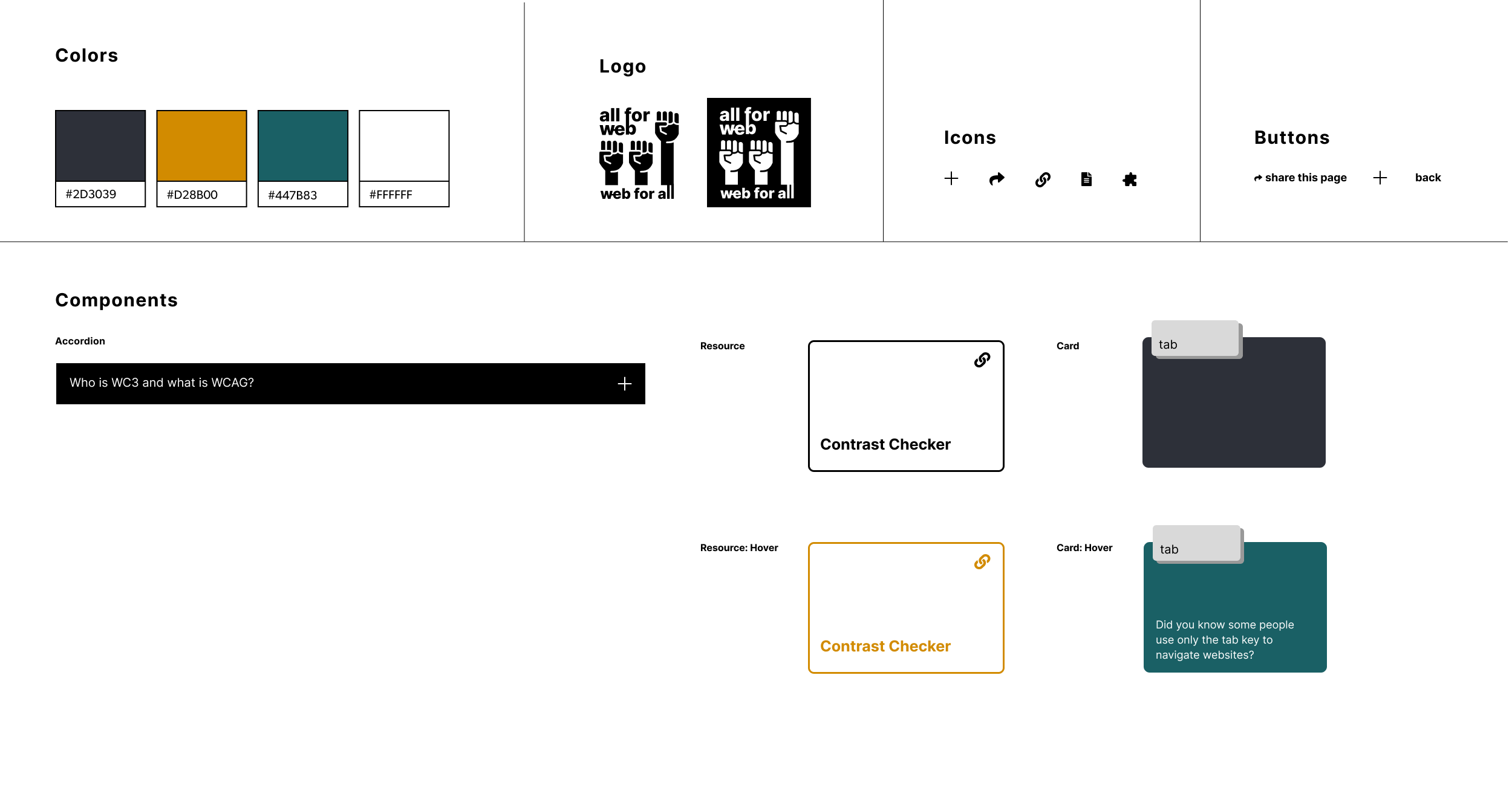
DESIGN SYSTEM
FINAL SCREENS

Client
All For Web For AllDate
January 10, 2020