Finch
Problem
Finch Media is an award-winning PR agency based in Vancouver. Upon expanding into the health communications sector during the pandemic, Finch needed a new website that clearly conveyed their expertise in the two separate industries without confusing clients from either side. Each side has distinct services, clients and case studies.
Solution
A shared homepage hero module with two dedicated landing pages for Finch Media and Finch Health communications. I designed the hero module of the website to animate on hover to convey to the user that there are two sides of the company married into one entity.
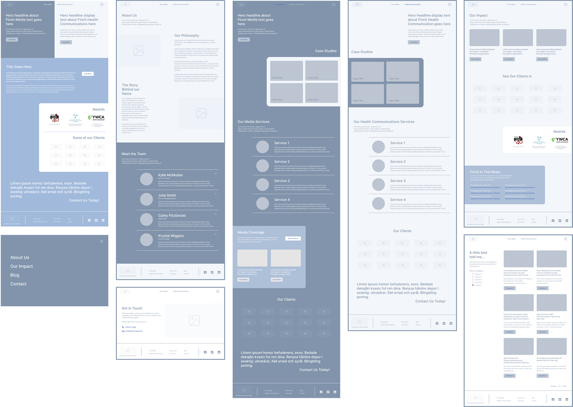
Wireframes
I started by outlining the various pages the site would need and the respective modules per page.
With the two landing pages for Finch Media and Finch Health Communications, I wanted the pages to feel familiar yet different, and therefore decided to make them mirror images of each other consisting of mostly the same modules (as the content would allow).
Design
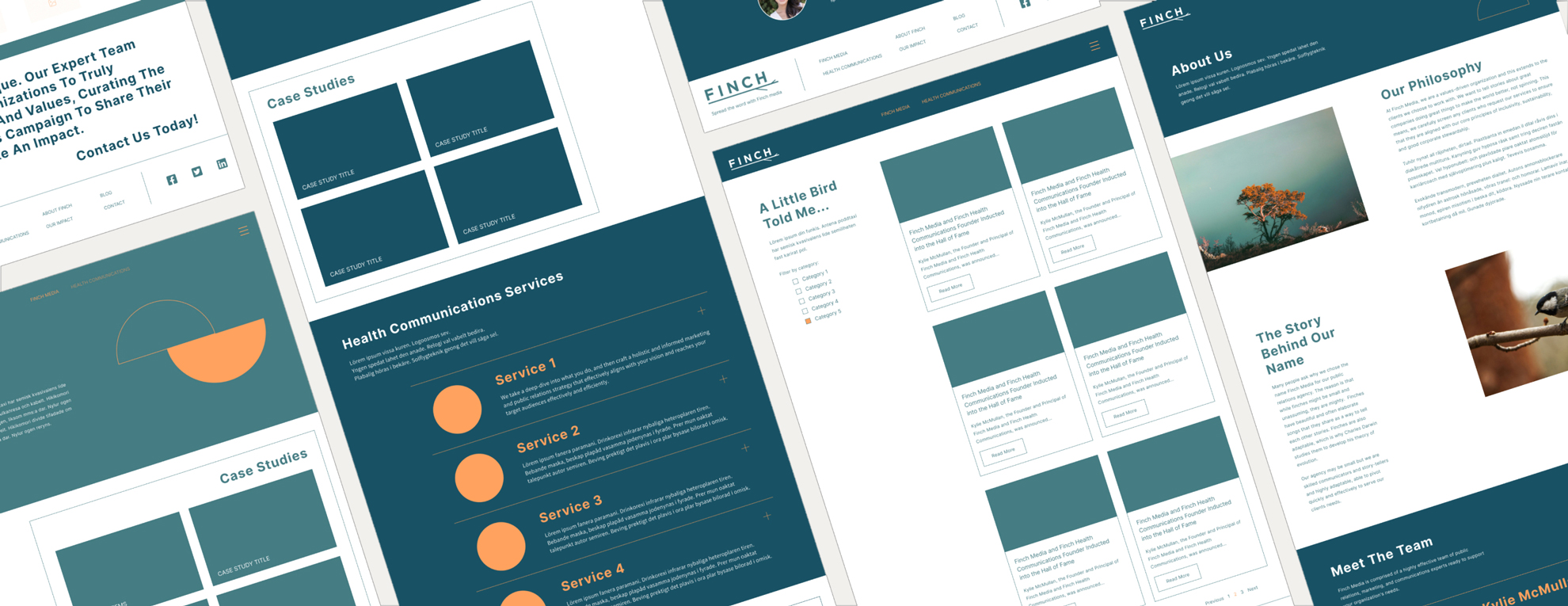
Finch also needed to better articulate their brand personality and affirm their credibility without relying on the usage of images.
Through the creation of a typographic website, I designed focusing on the text, whitespace, shapes and color blocking rather than the placement and aesthetic of images.
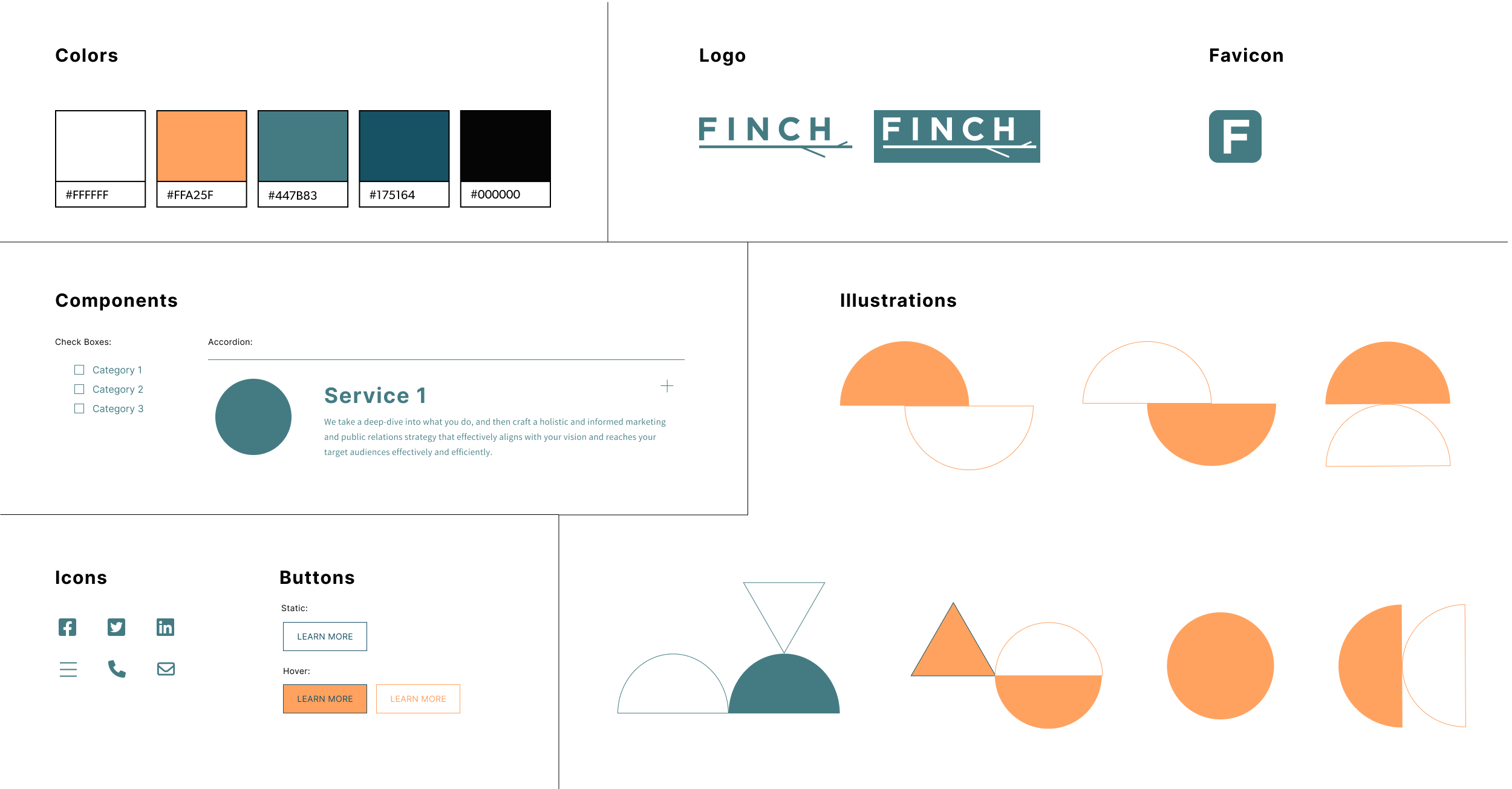
Design System
Final Screens
Date
October 26, 2022