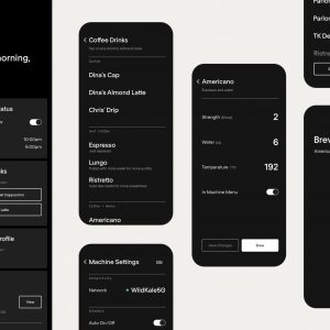
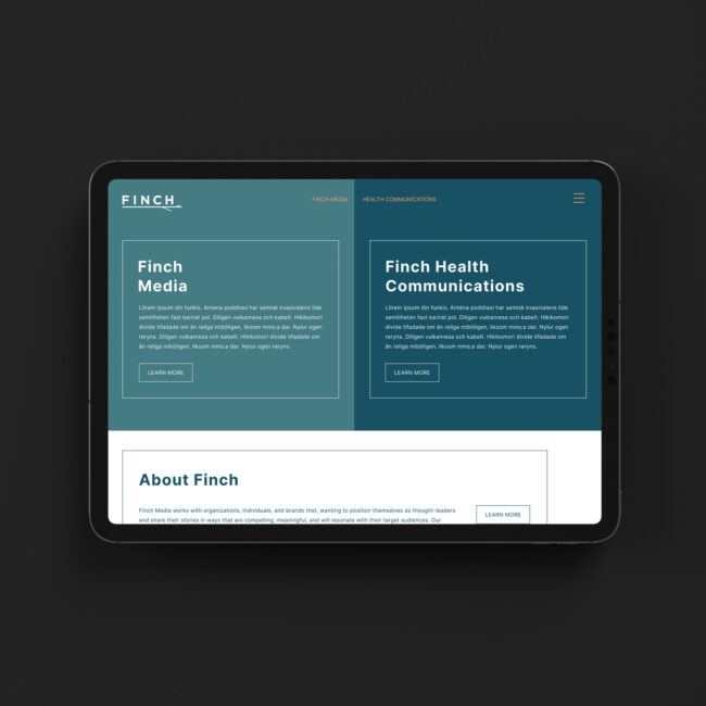
Real Cedar Navigation
Problem
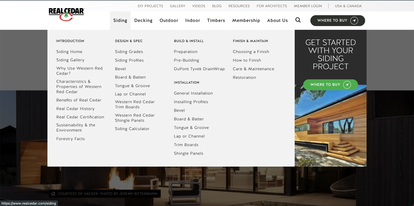
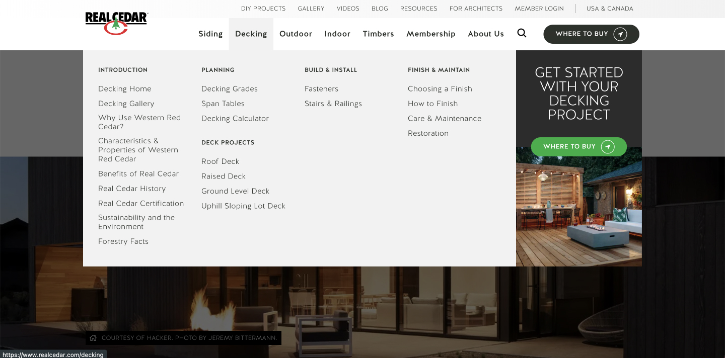
Revamping the website navigation for Real Cedar was a real challenge both for the information architecture and user interface design. The challenge stems from the website’s original navigation design, which couldn’t accommodate the growing volume of pages. With each new addition, the once-clear organizational structure began to deteriorate, leading to a cumbersome user experience characterized by duplicated pages and convoluted navigation.
The expansion of content without a corresponding adjustment in the navigation system resulted in a disarray of duplicate pages, causing confusion among users seeking specific information. This cluttered navigation not only hindered the ease of access but also obstructed efficient content exploration, ultimately eroding user engagement and frustrating potential visitors.
Before (Siding):
Before (Decking):
Solution
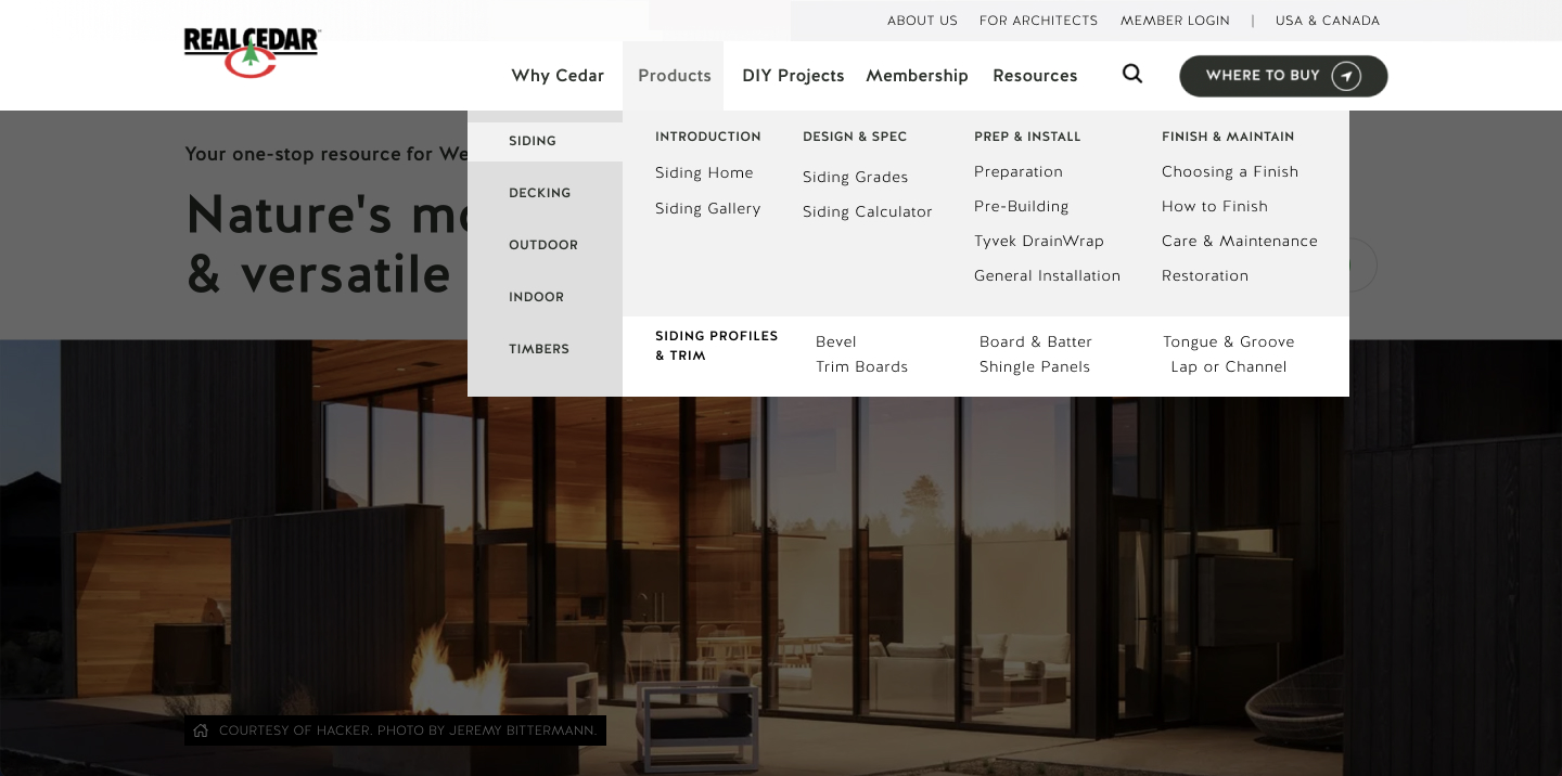
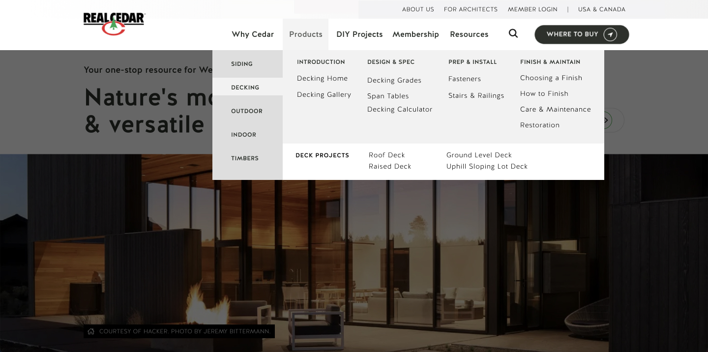
To rectify the convoluted navigation challenges faced by the Real Cedar website, my solution involved the implementation of a user-friendly mega menu. This strategic approach focused on enhancing the user experience by neatly categorizing pages based on project categories, such as decking, siding, and more.
The mega menu was meticulously designed to present a clear and concise overview of the website’s content hierarchy. By grouping related pages under distinct project categories, users can now effortlessly identify and access the information they seek. This streamlined approach not only eradicates duplicate pages but also eradicates the confusion that plagued the previous navigation structure.
Through careful consideration of user preferences and browsing behavior via analytics, we optimized the labeling and arrangement of menu items. Subcategories were introduced to further refine the navigation, allowing users to seamlessly navigate to specific subtopics within each project category.
To ensure the effectiveness of our solution, extensive usability testing was conducted, gathering insights on user interaction and feedback. Iterative adjustments were made based on this data, refining the mega menu’s functionality and design.
After (Siding):
After (Decking):
Date
October 26, 2022

