Trades Training BC
Problem
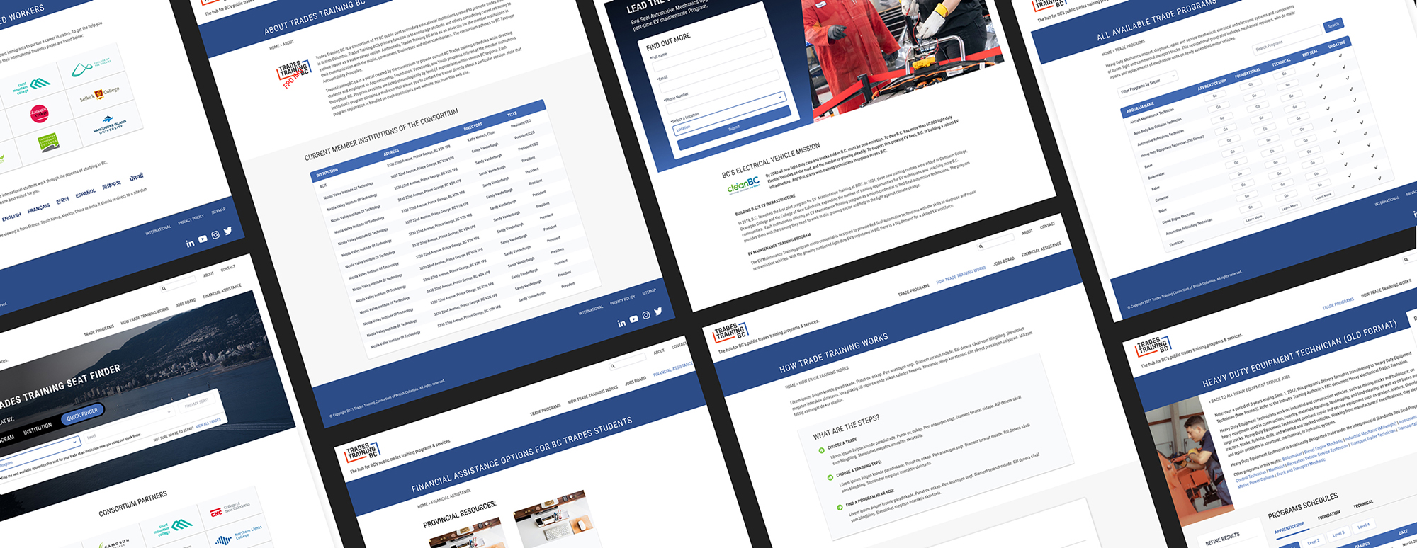
Trades Training BC is a consortium of 15 public post-secondary educational institutions created to promote trades training in British Columbia. Upon updating their website backend, they also wanted to undergo a general refresh to improve the overall usability and credibility to motivate students and others considering career retraining to explore trades as a viable career option.
Solution
I designed them a new website that retained some of the old identity while modernizing it with current design trends, as well as mapping out the various users and user experience pathways to ensure the path of least resistance.
Wireframes
This website utilizes a lot of tables, which typically are not mobile friendly and can be a painpoint for users. In the wireframes, we fleshed out how they would break on mobile in order to retain all the same content while displaying in a singular column. This requires custom styling for the table, as it would typically require sliding left and right.
We also focused on the homepage hero module, which contains the BC Trades Training Seat Finder. The seat finder is a quick way to filter search results for the user to find specific courses based on program, institution or ticket if they already know what they are looking for when coming to the site.

Design
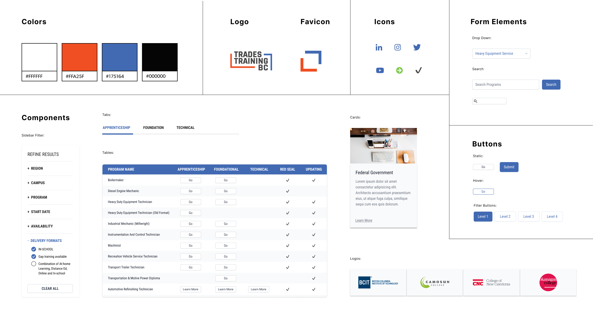
Trades Training BC also had a brand refresh performed on their identity with a new logo and accent color that needed to be translated onto the new website, but not much more apart from that. I designed the various system components to fit the needs of the website with the various levels of filtering and sorting as well as table styles. I designed the tables to have subtle background colors to differentiate between rows, but tried to keep it as clean and minimal as possible.
When selecting images for the site, I made sure to have equal representation in all the images to ensure all users feel inclusivity in trades.

Design System

Final Screens
Client
Trades Training BCDate
October 26, 2022


